
Let’s say you have created an HTML table with following markup:
<table id="xMyTable" style="width:100%;">
   <tr >
      <td style="vertical-align:top">
         <div style="border: 2px solid black; background-color:red; height: 100px;">
         </div>
      </td>
      <td style="vertical-align:top" rowspan="3">
         <div style="border: 2px solid black; background-color:orange; height: 600px">
         </div>
      </td>
   </tr>
   <tr>
      <td style="vertical-align:top">
         <div style="border: 2px solid black; background-color:green; height: 100px">
         </div>
      </td>
   </tr>
   <tr>
      <td style="vertical-align:top">
         <div style="border: 2px solid black; background-color:blue; height: 100px">
         </div>
      </td>
   </tr>
</table>
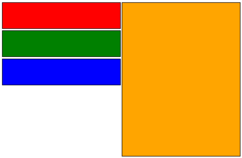
It’s very basic, one rowspanned cell that holds a content with large height on the right and 3 corresponding cells with content of smaller height on the left. You’d expect it to look like this:
Unfortunately as is it works only in Google Chrome. In the rest of the browsers, including Interned Explorer and famed FireFox it looks like this:
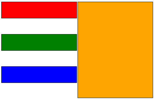
What happens is browsers automatically spread spanned cells height to evenly fit height of the cell with rowspan. To rectify this situation we need a little help from JavaScript. Continue reading →