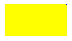
Rounded corners add nice touch to look and feel of a Web Page. User interface that employs rounded corners looks more streamlined, more ergonomic. Often to achieve that effect images are used, but this approach doesn’t allow quick style update and has other issues. Fortunately there is another way:
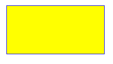
Compare 2 following DIVs:


First uses pretty basic CSS/HTML:
<style type="text/css">
.normal
{
    border: solid 1px blue;
    background-color:yellow;
    height:100px;
    width:200px
}
</style>

<div style="text-align:center">
    <div class="normal">
</div>
Let’s take a closer look at the second:
![]()
Under magnification it is clearly visible that “round effect” is achieved by 3 layers on top of main div – bottom layer 2 pixel high, middle and top 1 pixel high (and the top’s background color same as main DIV’s border color). Let’s build those layers using specifically styled DIV elements:
<style type="text/css">
.roundedTop
{
    background-color: blue;
    height: 1px;
    width: 192px;
    font-size: 1px;
    overflow:hidden;
}

.roundedMiddle
{
    border-left: solid 2px blue;
    border-right: solid 2px blue;
    background-color: yellow;
    height: 1px;
    width:196px;
    font-size: 1px;
    overflow:hidden ;
}

.roundedBottom
{
    border-left: solid 1px blue;
    border-right: solid 1px blue;
    background-color: yellow;
    height: 2px;
    width:198px;
    font-size: 1px;
}

.main
{
    border-bottom: solid 1px blue;
    border-left: solid 1px blue;
    border-right: solid 1px blue;
    background-color:yellow;
    height:100px;
    width:200px
}
</style>

<div style="text-align:center">
    <div class="roundedTop"></div>
    <div class="roundedMiddle"></div>
    <div class="roundedBottom"></div>
    <div class="main"></div>
</div>
Bingo! We got our element with rounded corners.
