Tag Archives: design

Mask Effect for EffectLayer for Pebble

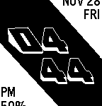
I’ve written before about EffectLayer library for Pebble smartwatch I’ve been working on. The idea is – user places the layer over screen and that layer applies an effect to screen content.

I’ve started with a few basic effects (invert, mirror) but since then several more developers joined the project adding more cool features. Ron added 90° rotation, zoom and lens effect. Gregoire Sage added cool blur effect. LeFauve not only added FPS effect, but also optimized the library to run the effects in a very efficient way: now effect can be defined as a function (even user defined function!) and that function passed as a parameter to effect_layer_add_effect method along with parameters for that effect.

I, for my part, contributed “mask” effect. What it does is essentially lets you show parts of background image thru user defined mask, creating a feel of transparency. Continue reading →

Infragistics WebDataMenu flashes unexpected color on hover

WebDataMenu
Infragistics WebDataMenu ASP.NET control comes both with predefined stylesets and allows you granularly overwrite any of the styles. For example definition like this

<ig:WebDataMenu ID="xmyMenu" runat="server" StyleSetName="Office2007Blue"
                 CssClass ="topMenuStyle" >
   <GroupSettings Orientation="Horizontal" />
   <ItemSettings CssClass="itemCssStyle" 
                 HoverCssClass="hoverCssStyle" 
                 SelectedCssClass="selectedCssStyle" />  
</ig:WebDataMenu>

will create a horizontal dropdown menu in default “Office 2007 Blue” styleset but allows you to overwrite individual styles via exposed CSS properties.

Let’s take a look at hover style. Continue reading →

Canvas for Pebble: How to hide time in all-day events

If you wish to create a custom watchface for Pebble Smartwatch but want it to have some more advanced features than very cool Watchface Generator offers then amazing Android app Canvas for Pebble is definitely for you.

Using it you can have your Pebble watchface to display weather, location, temperature, of course date and time, etc. etc. in highly customizable formats.

One cool thing it allows you to show – next calendar events from your Google calendar. As with everything else it’s a highly customizable entry. For example three (out of much more) options are:

%a – abbreviated day of the week
%R – start time of the event in 24-hour-format
%ET – event title

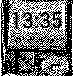
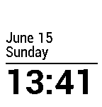
So if you format the calendar field as "%a %R: %ET" your Pebble will display something like "Mon 12:30: Visit from Elvis". Unfortunately if calendar event is an all-day event (e.g. national holiday) – start time of the event (%R) always displays as “00:00” making your event look like "Tue 00:00: Day of the Tentacle". It would be really nice if we could hide the time for all-day events.

Fortunately one of the things Canvas allows you to do is conditional formatting. It does this in a form of {text1#condition#text2} where if condition is true – text1 is displayed, otherwise text2 is displayed (which is optional and can be omitted).

I noticed that for all-day events, event duration (represented in Canvas as %ED) is always 24 hours (duh). So I replaced the above format for calendar event with this one: %a{ %R#%ED<24}: %ET. The code in braces means “if event duration is less than 24 hours – show event start time, otherwise don’t show anything”. And the result is in images above.

Partially hide external content with CSS overflow

If you ever hosted a content from external website in an IFRAME on your own site and wanted, for no reason whatsoever, to hide either top, bottom, left or right portion of that content – there’s an easy way.

Imaginge you have HTML markup like this:

<iframe frameborder="no" width="275" height="95" src="https://www.google.com/images/srpr/logo3w.png" />

It will display a pretty logo of some 3rd party company:

Now you got an idea to improve it a bit, by removing unneeded characters. Take a look at following markup:

<div style="width:275px;overflow:hidden">
   <div style="margin:0px 0px 0px -120px">
      <iframe frameborder="no" width="275" height="95"
      src="https://www.google.com/images/srpr/logo3w.png" />
   </div>
</div>

Our IFRAME is now enclosed into 2 DIVs. Internal one shifts left margin of its content 120px into the content, and external one effectively hides everything outside the margins via hidden overflow. The result:

Of course the content doesn’t have to be IFRAME with external content, but if it’s internal to your site that means you have full control over it and don’t need to use this hack.

Speed up UltraWebGrid with direct DOM access

Infragistics UltraWebGrid offers rich client-side programming model, but often it can be extremally slow. As an example consider a simple task: Given a particular Row ID hide the rest of the grid rows, keeping only this row visible.

Using UltraWebGrid’s CSOM (Client Side Object Model) JavaScript code looks like this:

var oGrid = igtbl_getGridById('xMyGrid');    // Get reference to grid object

for (var sRowID in oGrid.Rows) {   // Looping thru all rows in grid's rows collection

   if (sRowID != sSelectedRowID) {   // If current row ID is not given ID
      igtbl_getRowById(sRowID).setHidden(true) // Get reference to row and hide it
   }

}

The code works – it really does. But to loop thru 50 rows in this manner can take 10-15 seconds, not something your user will be happy about when instant action is expected. Continue reading →
Style Rounded Corner images of UltraWebTab thru external stylesheet

Infragistics UltraWebTab control offers multiple styling options, many of them can be set via external CSS classes. As a matter of fact about only element you cannot style via external stylesheet is rounded corner images. Or can you?

By default images used to give the tabs rounded-corner look are referenced directly in UltraWebTab ASPX markup:

<RoundedImage
   SelectedImage="./images/ig_tab_selected.jpg"
   NormalImage="./images/ig_tab_normal.gif"
   HoverImage="./images/ig_tab_hover.jpg"
   FillStyle="LeftMergedWithCenter">
</RoundedImage>

So, for example if SelectedImage looks like this:

Default Selected Image of UltraWebTab

It will give your tab appearance like this

Selected Image of UltraWebTab in action

Let’s examine it closer. Continue reading →
Style IFRAME scrollbars in IE

Internet Explorer offer CSS elements to style scrollbars, for example class

.FlatScrollbars
{
   scrollbar-face-color: #f0f0f0;
   scrollbar-shadow-color: silver;
   scrollbar-highlight-color: silver;
   scrollbar-3dlight-color: #f0f0f0;
   scrollbar-darkshadow-color: #f0f0f0; 
   scrollbar-track-color: #f0f0f0;
   scrollbar-arrow-color: #000000;
}

applied to a DOM element will render nice flat scrollbars:

Flat Scrollbars in Internet Explorer

Yes, it’s not standard CSS, but other browsers offer similar extensions (WebKit, I am looking at you). So, it works nice and well, but what if you want to style scrollbars of an IFRAME? Continue reading →
UltraWebGrid TopItemSpacing=”Auto”: Solution for FireFox

If you’re still using classic Infragistics Controls and want to make them work in modern browsers, sometimes a little additional work is required. Hopefully this little trick will save you some time.

UltraWebGrid has a neat property TopItemSpacing, when set to Auto it automatically spreads top level menu items across the menu control, giving them nice spacing in between. Unfortunately this property seems to work in Internet Explorer only, in Firefox (and Chrome and etc.) it is ignored, rendering menu in Compact mode giving top level items crowded “too-close-for-comfort” look.

The solution is to take spacing in our own hands. Set TopItemSpacing to Compact and instead add right padding to TopLevelParentItemStyle and TopLevelLeafItemStyle elements of the menu. For example (from the markup point of view):

<TopLevelLeafItemStyle Cursor="Hand" Height="18px" BorderWidth="1px" Font-Size="8pt">
   <Padding Right="6px" />
</TopLevelLeafItemStyle>

Actual pixel value of the padding is up to your particular scenario, but the final result is top level menu items will be nicely spaced both in IE and in Firefox.

ICS: Android 4 on Kindle Fire

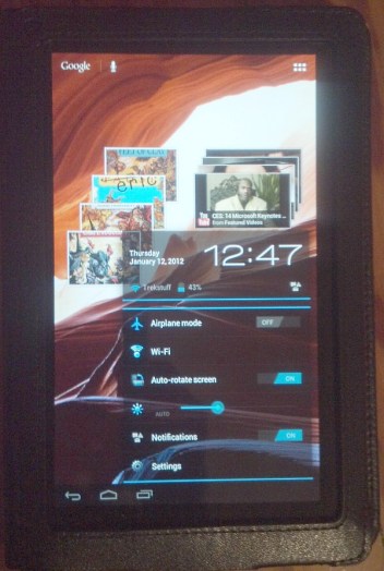
Ice Cream Sandwitch on Kindle Fire

Another day, another experiment on my new favorite toy business instrument – Kindle Fire. Today I went ahead and installed latest (as of this date) incarnation of Android OS – version 4 aka Ice Cream Sandwich (ICS). Again, like in case with CyanogenMod 7 (which is essentially Android 2.3.7) installation is extremally easy thanks to TWRP recovery. Just download Kindle Zone ICS ROM put it on your Fire, reboot into TWRP recovery, *backup your existing rom* and flash the ICS.

It boots nicely and looks pretty good. Connects to WiFi with Internet and LAN access (ES File Explorer comes preinstalled and accessed SMB shares on my home network with no problems).

Being a very early version it has it share of problems. Video doesn’t work correctly (MP4 files for example play in fast-forward mode, YouTube can’t connect). Sounds work sporadically and overall moving around the interface has a jerky feeling. But it looks like a very good start and I am looking forward to a more stable release. Meanwhile I am back to CM7


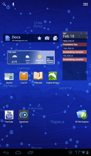
UPDATE 02/18/2012. Now this is what the doctor ordered. The new update from the same XDA forum thread as above breathed new life into my Kindle. Basically, everything works. And it looks awesome! Here is direct link to the ROM. So now this is my OS of choice for my Fire. Did I mention it’s Cyanogen Mod 9? Did I also mention that there’s Google Chrome now available on Android Marked for Ice Cream Sandwich?

Ice Cream Sandwich on Kindle Fire